UI & sound stuff
Big Sword » Devlog
The UI for Big Sword is pretty simple, there will be a start menu with some basic settings (hopefully editable controls but no promises) and I also want to create a help page which acts as a mini tutorial.
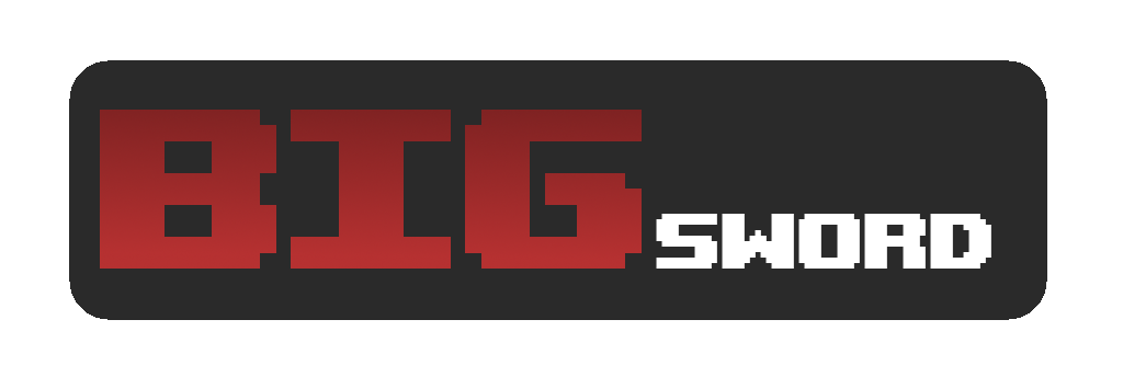
The first thing I did was mock up a logo:

Which I was pretty happy with. The font used is Upheaval, (https://www.dafont.com/upheaval.font). However after doing some basic start menu stuff I found that the logo was good in a vacuum but looked weird in the context of the menu. I wanted to incorporate the sword into the logo so this is what I came up with after a while:

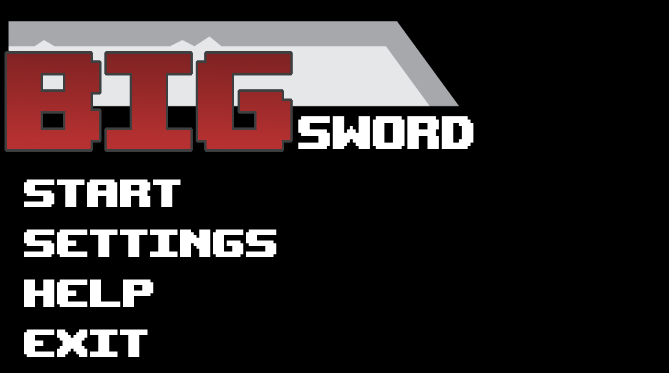
I think it could be a lot better but I like the incorporation of the sword and I'm not willing to put too much more effort into it so I'm happy with that.
The menu itself is going to be pretty minimalist because I'm not an entirely creative person. I set up some buttons and hooked up the different scenes to get myself up to this point:

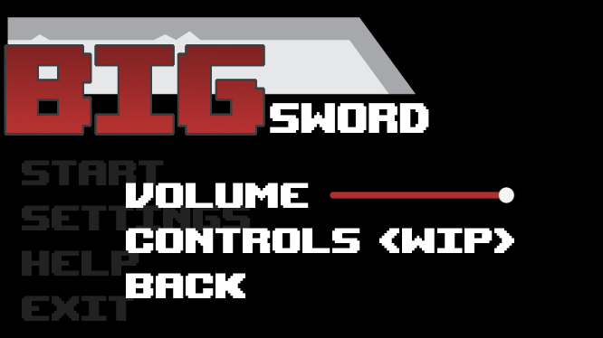
It's not much to look at but that way the players eyes are directed straight to whats important. Something cool I tried with the settings menu is to overlay it with the normal menu to get a fade in effect:

Looks rather cool, but I'm a bit lost in how to incorporate a controls menu on top of that so might change it.
The volume variable was quickly set up through PlayerPrefs and just acts as a master volume for background music and SFX.
Speaking of SFX I found this neat sound for flicking through the menus on opengameart, https://opengameart.org/content/menu-selection-click
Big Sword
| Status | In development |
| Author | jofbob |
More posts
- Finished Game ProjectMay 30, 2021
- Melee combatMay 30, 2021
- The player & the swordMay 30, 2021
- Enemies & SpawningMay 30, 2021
- The basic levelMay 30, 2021
- Game ConceptApr 15, 2021
Leave a comment
Log in with itch.io to leave a comment.